Transforming a cybersecurity platform into a more modern product experience
A leading cybersecurity learning platform had outgrown its visual identity. The product surface no longer reflected the maturity of what the company had become.
Some visuals and UX writing have been adapted for confidentiality.
- Role
- Product Designer
- Duration
- 2 weeks
- Scope
- Rebrand + Landing redesign
- Pages
- +34 pages
- Work
- UX/UI + Product Marketing

Start with the right questions
Visual decisions only hold up when the strategy underneath them is clear. The first phase was about framing the problem before touching the interface.
Why does this redesign exist?
Anchor every decision in a business reason — not aesthetics. The redesign existed to close the gap between product maturity and product perception.
What should it support?
Stronger first impressions for new visitors, clearer product communication, and a surface the team could extend without breaking.
Where does the experience break?
Inconsistent hierarchy, weak CTAs, and uneven spacing — small things that compounded into a fragmented feel.
What stays untouched?
The product's voice, the technical depth, and the trust the brand had already built. The redesign refines, it doesn't reinvent.

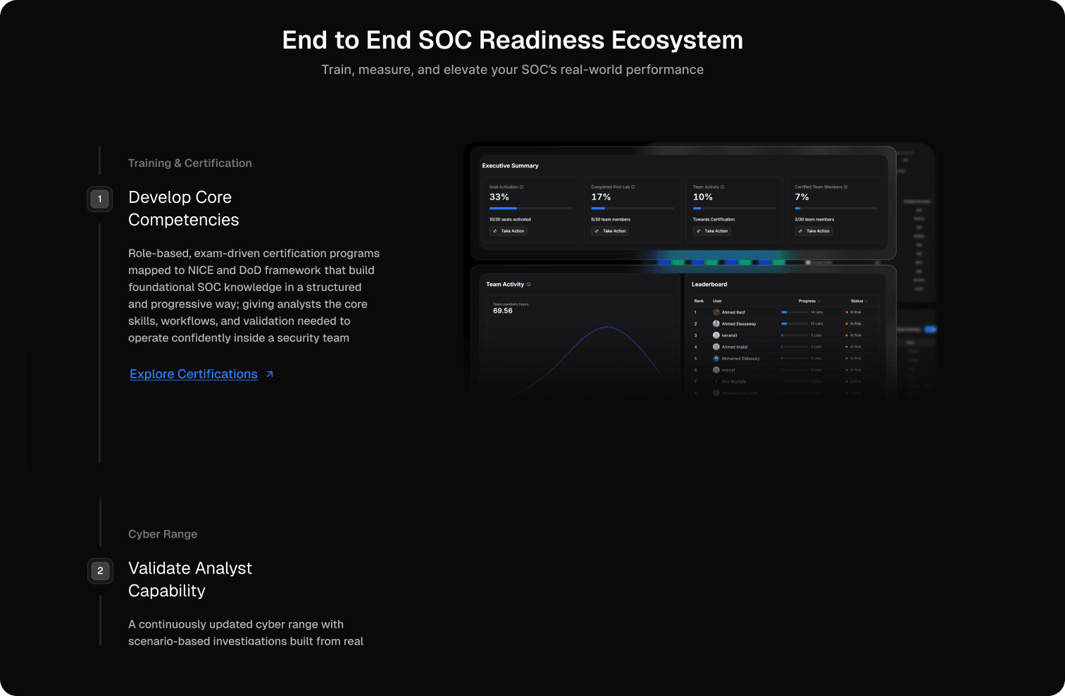
The goal wasn't a new coat of paint. It was a shift in how the product was perceived.
Before opening Figma, the work started by naming what was actually slowing the product down — across business, user, and system layers.
Perception lagged maturity
The platform read as a learning tool — not a serious cybersecurity product.
Friction hidden in inconsistency
Patterns shifted page to page, eroding trust silently as users moved around.
No shared visual language
Components, spacing, and typography drifted — impossible to scale cleanly.
Premium perception through hierarchy and polish
Consistent components across every surface
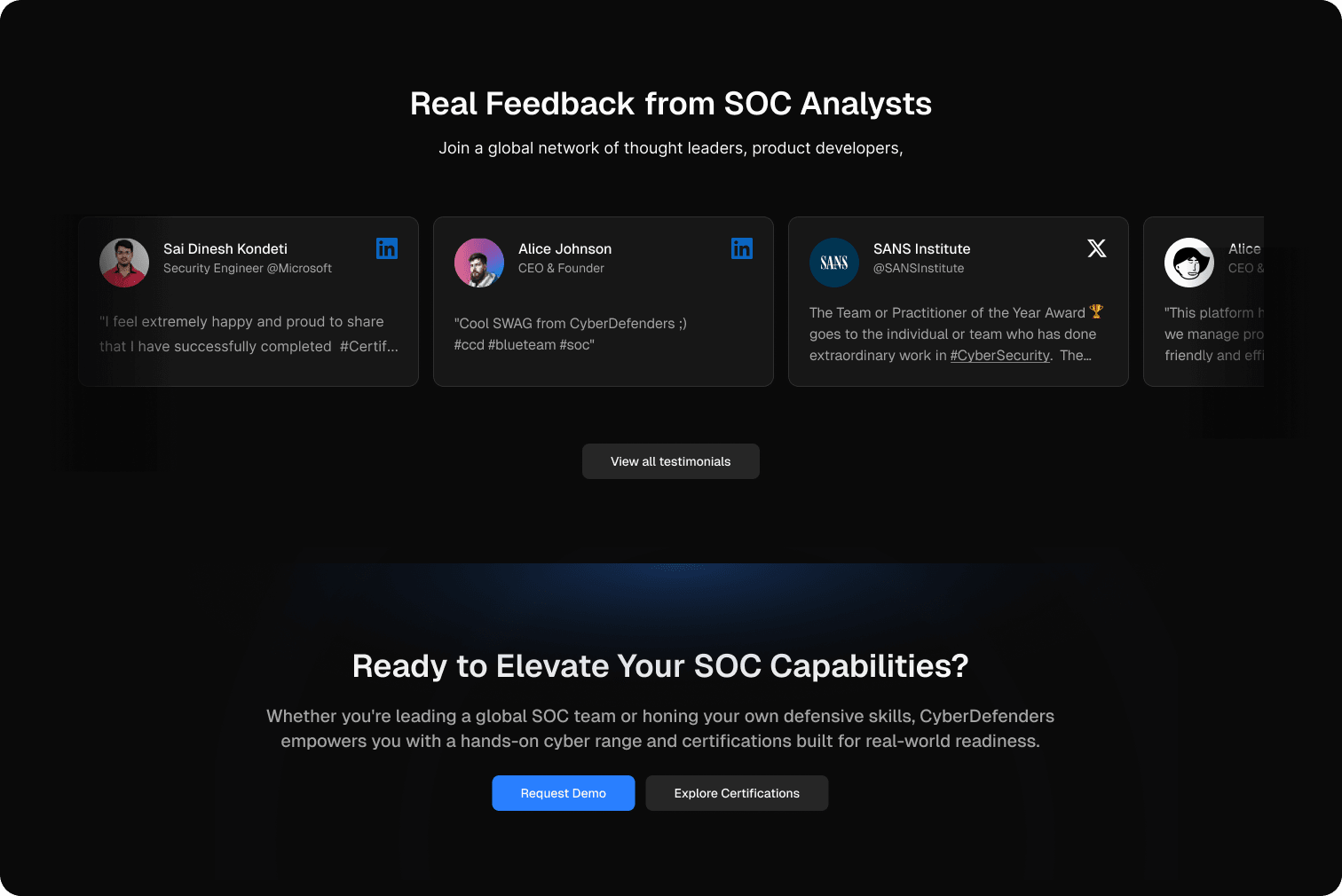
Intentional motion that makes the surface feel alive
Before and after, framed by intent
Each transformation is anchored in a single product goal — not just a visual change.
Stronger first impression
Reframing the hero around clarity and confidence — so the platform reads as a serious cybersecurity product within seconds.

More structured product communication
A modular layout that lets product surfaces breathe and scale, with a clearer rhythm between sections.

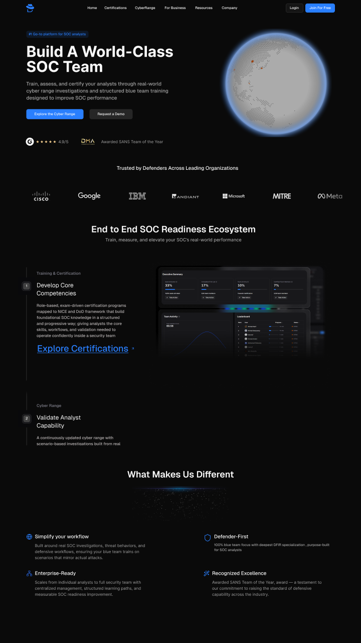
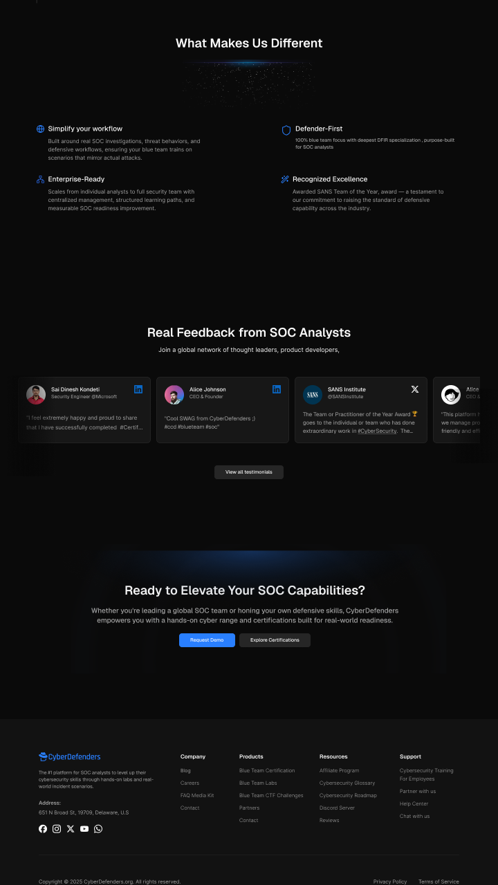
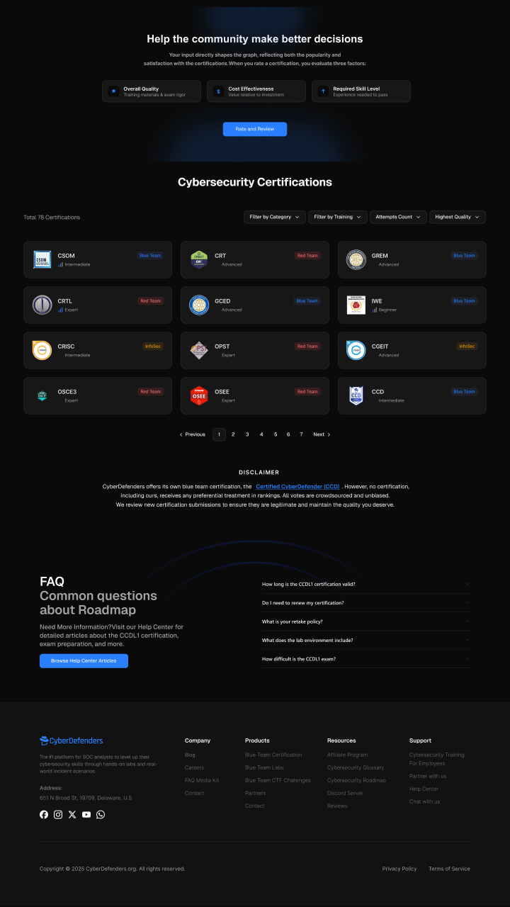
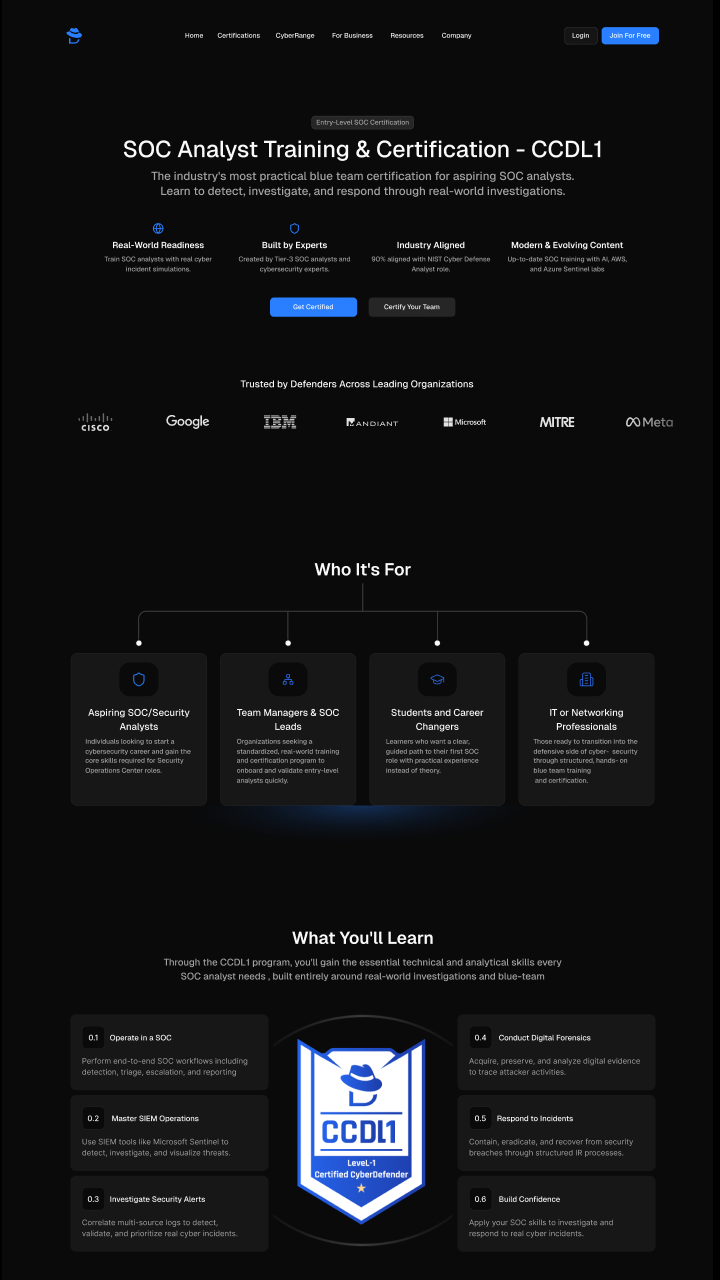
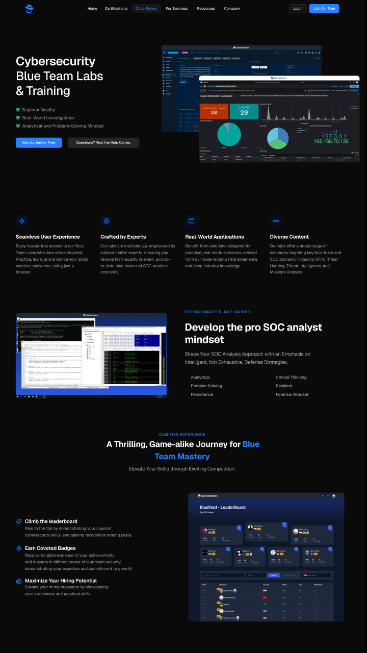
Transformation gallery — explore the redesign
A more cohesive product surface, built to scale
The redesign sharpened how the platform is perceived, brought consistency to a fragmented surface, and gave the team a visual system they can extend without it falling apart.
Stronger product perception
Improved visual consistency
More cohesive user experience
Scalable visual system